What is the easiest way to setup a good-looking, efficient website? Use a website builder. In a matter of hours, you can create a compelling website and go live.
How good are these websites on mobile? Excellent, actually. Major website builders use responsive templates.
1&1 templates are presented in desktop and mobile configurations
And you probably expect the favicon support to be as great as the templates themselves. Oh, my sweet summer child…
You won’t have anything but the plain old, desktop favicon
For this research, we analyzed 6 website builders and focused on their demos sites:
Long story short: all of them support the basic, old school favicon for desktop browsers. And none of them have anything more to offer, with the exception of Strikingly. It is interesting to look at their solution:
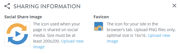
Strikingly “favicon editor”
On the right, the favicon itself. Upload an image et voilà! Fair enough. On the right, an image labeled “Social Share Image”. The image here actually serves two purposes:
Facebook Open Graph image
Apple Touch icon
These two images are supposed to be completely different. They should have different dimensions and content.
And this is the best solution around.
Website builders have no favicon for modern platforms
Alright, users cannot create icons for all platforms. It is interesting to note that website builders have not even setup their own homepage: all come with classic desktop icon, nothing more:
The exception here is Squarespace, which has its own Apple Touch icon (for some reasons, it is ill-declared: the 180×180 is declared as the 152×152 icon, etc.).
How to fix
The major issue here is the gap between website design (excellent) and favicon support (minimalist). With the iPhone celebrating its 10th anniversary this year, users can expect an full-fledged favicon support, not only the one that was okay at least 4 years back.
Hum… What if the website builders could leverage the power of RealFaviconGenerator to finally offer to their users the solution they deserve? Wait a minute, we are working on it right now and we call it favicon web components! This is how website builders could look like:
If you use Facebook, you must be used to this kind of thing in your news feed:
Someone (a friend maybe) shared some content and here you are with a title, a description, a link to click. And an image. This image is important because it has the power to grab the attention and generate visits.
This image is usually provided by the shared page, via specific HTML markups. Facebook sticks to the Open Graph specifications and adds a few more requirements, for example regarding the image dimensions.
For many sites, like blogs, the Open Graph image should be a classic, along with the page title and description. Facebook is often of critical importance to generate traffic. Is the Open Graph image correctly created?
An issue (among others)
To answer this question, let’s focus on a particular point. Facebook displays 19.1:10 images in its news feed (eg. 1200×630, because 1200/630=1.905; close enough). When it finds an image of another ratio, it automatically crops it to turn it to 19.1:10.
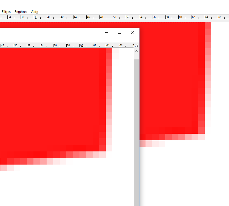
For example, let’s consider this 540×619 image:
When the related page is posted to Facebook, the image becomes:
It is easy to understand how Facebook proceeds. It simply crops the image as much as necessary to make it 19.1:10. To do so, it normally removes the same amount of border on each side to keep the center of the image:
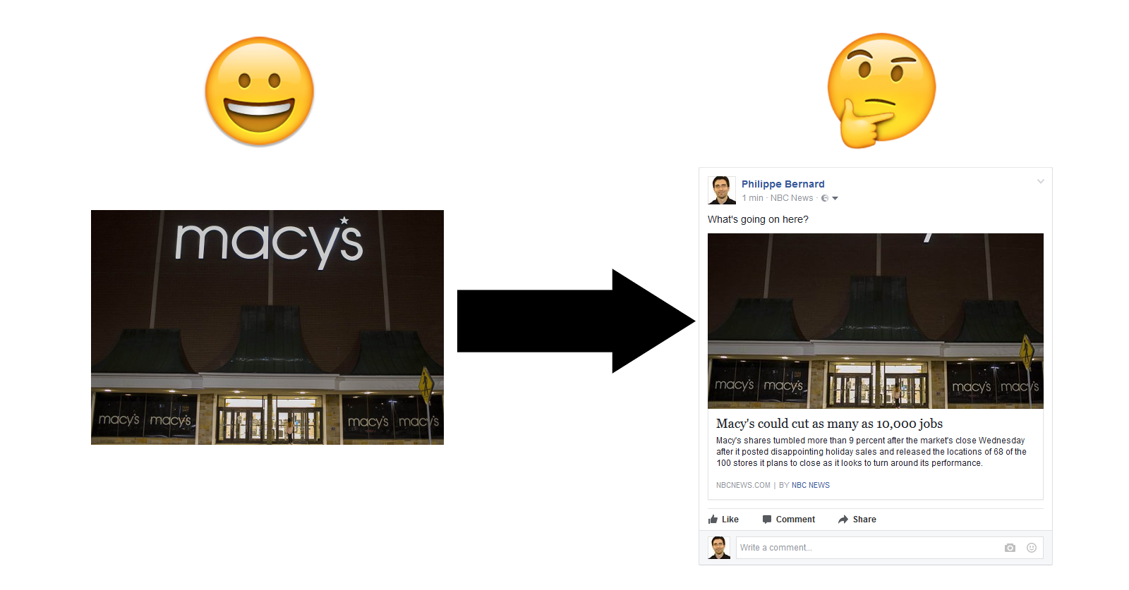
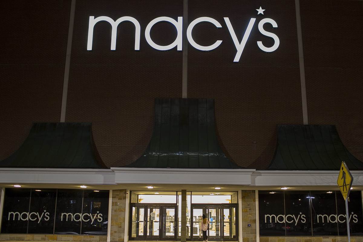
Now the deal is clear: if you don’t provide a 19.1:10 image to Facebook, it will be cropped automatically. Which can be okay or plain wrong, depending on the image. Take this NCB News article about Macy’s. Its Open Graph image is:
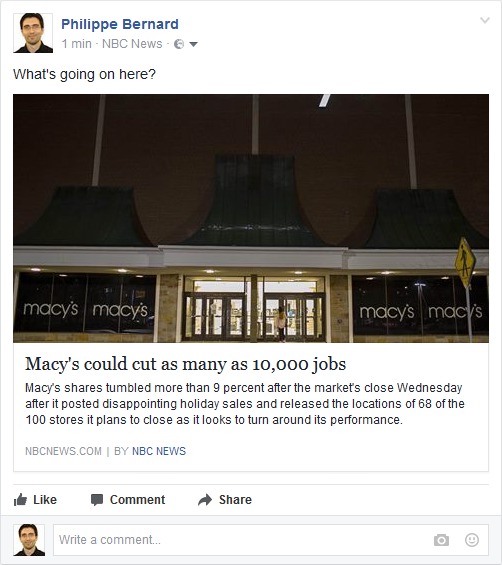
We can clearly see the name “Macy’s” and the showcase, so this is probably a good photo to illustrate the article. However, when shared on Facebook, the outcome is rather poor:
“Macy’s” was entirely stripped and the photo is now quite dark.
Open Graph image in the wild
To investigate how the Open Graph images are prepared, 40 sites were selected, 10 in each of the following categories:
News sites (Yahoo News, CNN, etc.): They are high traffic sites everyone know. Facebook can be a major source of traffic for these sites, so they are likely to pay attention to the Open Graph images.
Tech blogs (TechCrunch, Mashable…): Same as news sites, plus they are tech-related. Can’t be wrong!
Blogs about WordPress (WPTavern, wplift…): As WordPress-related blogs, they must know about the right tools to have everything right, including Open Graph images.
Social Media blogs (Buffer blog…): Because social media is their core business, they must be especially careful with Facebook-related material.
Results (**drum roll**)
And now, the shocking truth: out of these 40 sites, only 3 are doing it right. Hat off to TechCrunch, Mashable and the New York Times. The later must have a dedicated tool or process for this, because its Open Graph images not only have the right dimensions, they are also cropped manually. I have no strong opinion about TechCrunch and Mashable but I suspect them to auto-crop the images, making the process less relevant: the goal is to do it manually in order to achieve the best result. Not to leave this to an automated tool.
What about the other sites?
Out of 40 sites, only one does not have any image (ITBusinessEdge). All the others come with an og:image markup. This is the sign that web site editors have plans for the Facebook metadata.
However, things are not that crisp when going into the details: 36 sites do not follow Facebook requirements and are exposed to auto-crop.
The next question is “how much?”. After all, removing a single row of pixels cannot hurt. On average, 13% of the surface of the analyzed images is cropped. This is significant, especially from high traffic and/or specialized sites.
Some sites seem to have no particular policy regarding Open Graph image dimensions. For example, on WPTavern, out of 10 posts, the average cropped surface is 18%, with a standard deviation of 14% (and a maximum of 41%). I suspect this is because the featured image (a term WordPress users should be familiar with) is used as the Open Graph image as is. This pattern must be encountered very often.
Some other sites apparently have a “fixed dimensions” policy, but ones that are not accurate. Both CNN and NBC News always expose the same image size. CNN has a systematic 7% of cropped surface, 21% for NBC News. The sad winner is HowToGeek with 43%. The Open Graph images are actually so small that Facebook ignores them and rather picks images right from the shared pages.
Conclusion
This small study shows how sites handle Facebook sharing: they support Facebook, but they do not support it well. This is the purpose of the new RealFaviconGenerator Facebook metadata editor: do it, and do it perfectly.
And for those who know what RealFaviconGenerator is in the first place, you probably recognize the pattern: a few years ago, favicon generation was very poorly addressed. But folks were used to it. Once RealFaviconGenerator came in with the favicon editor the community deserved, the expectations started to change and nowadays everybody want “all the icons”. And the smarter among them use RealFaviconGenerator 🙂
Methodology
The tested sites were obtained by googling something like “most popular news sites” and picking the first sensible list. In the end, the tested sites are not guaranteed to be the most relevant, but the outcome should be good enough.
Then, for each tested site, a sample post was randomly picked (eg. a news site headline article, a WordPress blog latest post, etc.).
Android Chrome behaves almost like iOS: it scales down the icons correctly when it cannot find an icon that exactly matches its screen, producing excellent results using an algorithm similar to Blackman or Lanczos. Just mind special icons, such as pixel art icons that need a particular kind of algorithm such as Nearest Neighbor. But even in that case, Android Chrome offers a decent result.
I made a test with my old Galaxy S5. When Android Chrome is given a manifest declaring all documents icons for homescreen and splashscreen (9 icons, ranging from 36×36 to 512×512), it takes the 144×144 icon for the home screen and 384×384 icon for the splashscreen. Which is a good thing: as it is suggested to declare only two 192×192 and 512×512 icons, the Galaxy S5 is a good candidate to check the scale down in a real life situation.
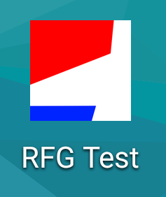
For this test, I used this sample 512×512 icon and declared it, alone, in a manifest:
Android Chrome original 512×512 icon
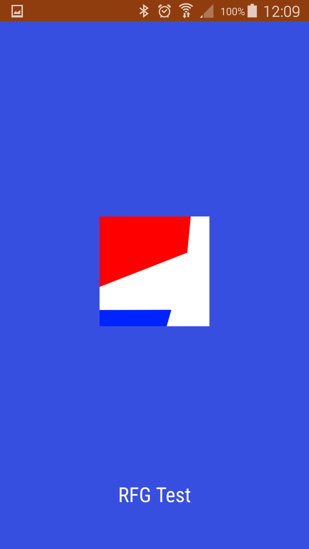
Here is what my Galaxy does with it:
Added to home screen : the icon is now 144×144Splash screen, the image is now 384×384
In both cases, we can see that the results are great (despite of my suboptimal choice of theme and background colors).
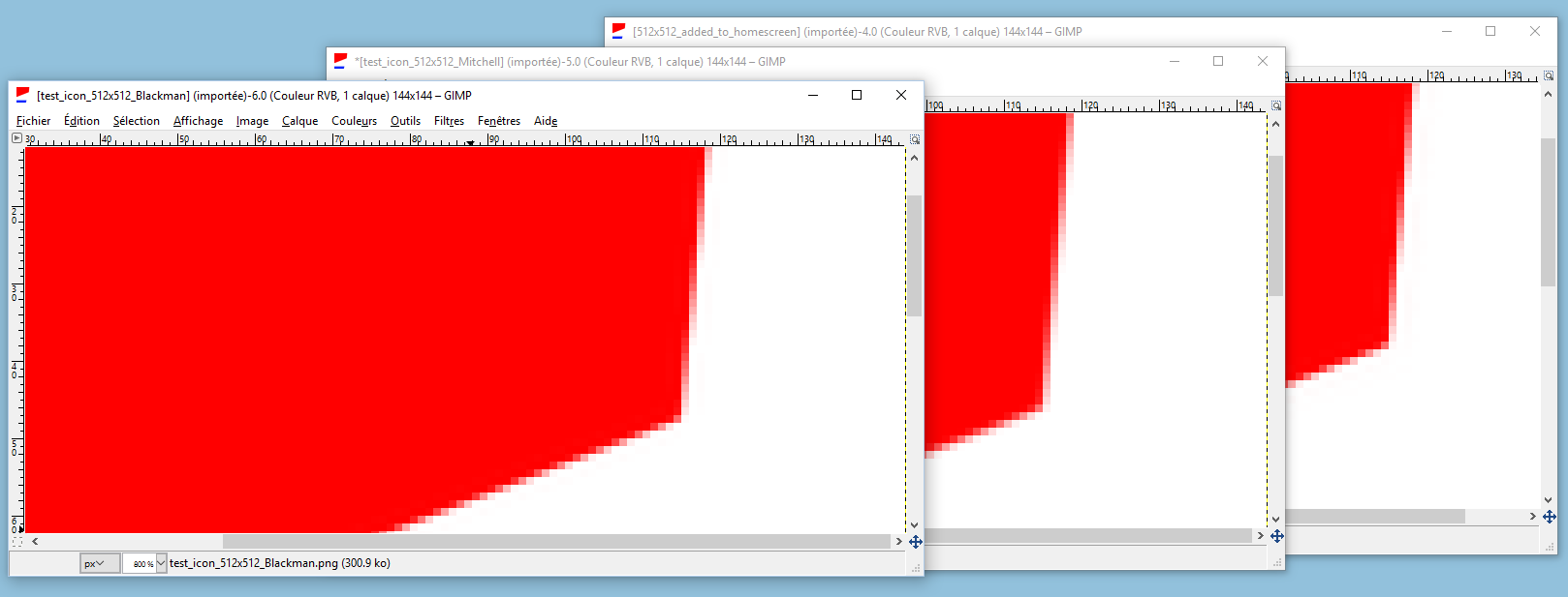
As for iOS, I couldn’t find an exact match with any of the 40 algorithms provided by ImageMagick. The closest ones are Blackman, then Lanczos.
Visually, I can’t see any difference between what Chrome creates and the 512×512 icon resized to 144×144 by ImageMagick with Blackman and Lanczos:
What about a pixel-art icon, one that shouldn’t be interpolated?
512×512, pixel art icon
It’s okay, really:
A pixel art icon added to home screenPixel art icon splashscreen
As with iOS, you can spot differences between what you get and what you could expect by providing the icon with the right size (eg. 384×384 for splashscreen and my Galaxy S5) and scaled with the right algorithm (eg. Nearest Neighbor). But it’s no big deal.
When iOS Safari encounters an Apple Touch icon too large for the screen, it scales it down. Which scaling algorithm does iOS use for this task? It’s not clear. Maybe something close to Lanczos2. The main issue is when the icon requires a particular algorithm, such as Nearest Neighbor: iOS doesn’t exactly produce the expected result. But it’s no big deal.
What is the problem?
There are a lot of Apple Touch icons, ranging from 57×57 to 180×180. If you really want the full story, you can generate up to almost 20 icons! However, when an icon is missing, that’s not a blocking issue. iOS scales the icon down.
As suggested by several users and “summarized” in issue #211, it would be great to generate only one Touch icon (or only a few ones) and let the devices do the scaling. Issue solved, right?
Not so fast. There is one tiny question to answer before dropping almost redundant 20 icons: how good is iOS at resizing pictures?
Finding iOS scaling algorithm
The methodology:
Create a sample 180×180 icon with a diagonal line in it:
Push this image in a web site and add it to the home screen of my iPad Mini running iOS 9:
Here, iOS resizes the pic to 76×76.
Crop the rounded corners to remove all traces of background:
For each algorithm supported by ImageMagick (come on, more than 40!), repeat the same steps with Image Magick commands (ie. scale with the tested algorithm and crop the result), then compare iOS and ImageMagick.
And the result is… iOS doesn’t use any of the algorithms offered by ImageMagick. After studying the results returned by the ImageMagick’s compare command, this is apparently close to Lanczos2. But it’s not exactly the same. In other words, iOS applies a small anti-aliasing effect. Most of the times this is just fine.
Small issue with specific Apple Touch icons
Some images require a specific scaling algorithm. For example, you don’t want the classic scaling with pixel art pictures. Quite the contrary, you want to retain the pixelization. In this case, iOS doesn’t do what you want.
When we zoom the icons, there is clearly a difference:
On the left, a 180×180 icon scaled down by iOS. On the right, a 76×76 icon prepared with RFG and the Nearest Neighbor alforithm.
Yet, at normal scale, it’s nearly not visible. I frankly can’t see the difference between the two:
On the left, a 180×180 icon scaled down by iOS. On the right, a 76×76 icon prepared with RFG and the Nearest Neighbor alforithm.
Conclusion
If you are careful enough to pick a particular scaling algorithm when generating your icons (eg. Nearest Neighbor), then you might want to keep all the icons to make sure your visitors really get the icon you want. Else, you can safely drop smaller icons. iOS will do just well.
Warning: With the release of iOS 8, the recommended size is now 180×180. It was 152×152 when this article was published (updated 2014/12/26).
Whatever you use an iOS or Android device, the Apple touch icon appears as soon as you bookmark a web site or add it to your home screen. It is the only element still visible once you leave the site. It should be in the checklist of every web project. But this is often not the case.
A link to Apple web site
For this study, the Apple touch icons of the 5,000 most visited web sites were studied. More precisely, this analysis focuses on the apple-touch-icon.png file located in the root directory. Although this file is not a strict requirement, it is so emblematic that studying it alone makes sense. More about this in the methodology below.
First things first: how many apple-touch-icon.png were found and probed? 804. This 16% score sounds low, but again, this file is not required for the Apple touch icon to work. A previous study concludes to a 60% support rate. Therefore, this figure should not be taken too seriously. What matters is what lies in these 804 icons.
The right answer was…
… 152×152. 180×180, thanks to iOS 8 (updated on September 26th, 2014).
Apple defines 4 icon sizes, from 60×60 up to 152×152. What the specifications forget to mention is that these sizes are for iOS 7. To support iOS 6 and prior, you need 4 other dimensions.
iPhone
iPad
non-Retina
Retina
non-Retina
Retina
iOS 6 and prior
57×57
114×114
72×72
144×144
iOS 7
60×60
120×120
76×76
152×152
The specifications do not explicitly define the size of the apple-touch-icon.png picture, but a good practice is to provide a 152×152 picture. An iPad with a Retina screen running iOS 7 will use it as is, while the other devices will scale it as needed (unless they find a more suitable icon).
How many web sites follow the 152×152 recommendation? 33. A good 4%. Oh. Among them, Apple.com.
Nearly as many sites have a 60×60 icon, which is the other size you might pick after reading the Apple specs. Some others resolutions are more popular, like 114×114 (79 sites) and 144×144 (72 sites). But the winner is clearly 57×57 with 281 sites. This resolution is outdated, but it is still the reference. Google for “apple touch icon size”: at the time of writing, the first result is from StackOverflow and the first answer documents 57×57.
An apple-touch-icon.png with an iOS 6 size is the sign that it has not been updated for a while. Yet, it does not prove that the Apple touch icon won’t work on modern devices. Take Bing.com, one of the 57×57 supporters: it also defines apple-touch-icon-152x152.png. You shiny iPad will use this picture.
This leaves us with 68% of apple-touch-icon.png with a resolution recommended (or used to be recommended) by Apple. And 32% of… something else.
Apple touch icon bloopers
Creative resolutions
18 sites have a 100×100 icon, like imgur. Stackoverflow, TheGuardian and 15 others use a 158×158 picture. NewRelic’s icon is 80×80.
Some sites anticipate the Super Retina HD screen: Tumblr exhibits a 300×300 picture. BuildWith and 6 others come with a 512×512 icon. ClipHunter (not safe for work…) takes this very seriously with a 1024×1024 picture.
Although these sizes are unexpected, iPhone and iPad are able to process them.
Square icons are so mainstream
Sure, the 175×175 icon of Flickr is not standard. But at least, this square picture can be scaled as needed by iOS. On the other hand, the 155×45 picture of Kioskea cannot fit the iOS UI. Apple’s mobile platform does its best but it makes no miracle.
The 155×45 apple-touch-icon.png of KioskeaKioskea bookmark
The 1194×687 apple-touch-icon.png of 1111.com.tw is another interesting case: this is a white picture.
1111.com.tw, 1194×687 pixels of zen and fullness
12 sites are impacted by this issue and 3 others were probably tricked during the creation of the icon. There is a difference of 1 pixel between their width and height. For example, the picture of HTCMania is 56×57. So close.
Small is beautiful. Sometimes.
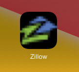
Some sites have really big icons and some others take the opposite path. 7 sites have a 32×32 picture, among them Media.net and ADSLGate. Zillow and 4 others are 16×16. Duowan.com’s is only 8×8.
Pixel art maybe?
No less than 26 sites, such as AOL and NBCSports, choose a radical approach: the 1×1 icon. It reminds me of the old times, when complex HTML designs were made of stretched transparent 1×1 GIF pics. Except that such setting does not make any sense for apple-touch-icon.png. Note that some of these sites are a bit tricky. AOL, for example, also declares valid Apple touch icons. As a consequence, iOS visitors do not hear about the strange 1×1 picture.
4G recommended
Resolution is one thing, file size is another. The studied icons weigh 8.5KB on average, but some pictures are way larger. Yelp’s icon is 91KB, which is a lot when you consider that it is 57×57.
91KB, 57×57 Yelp icon
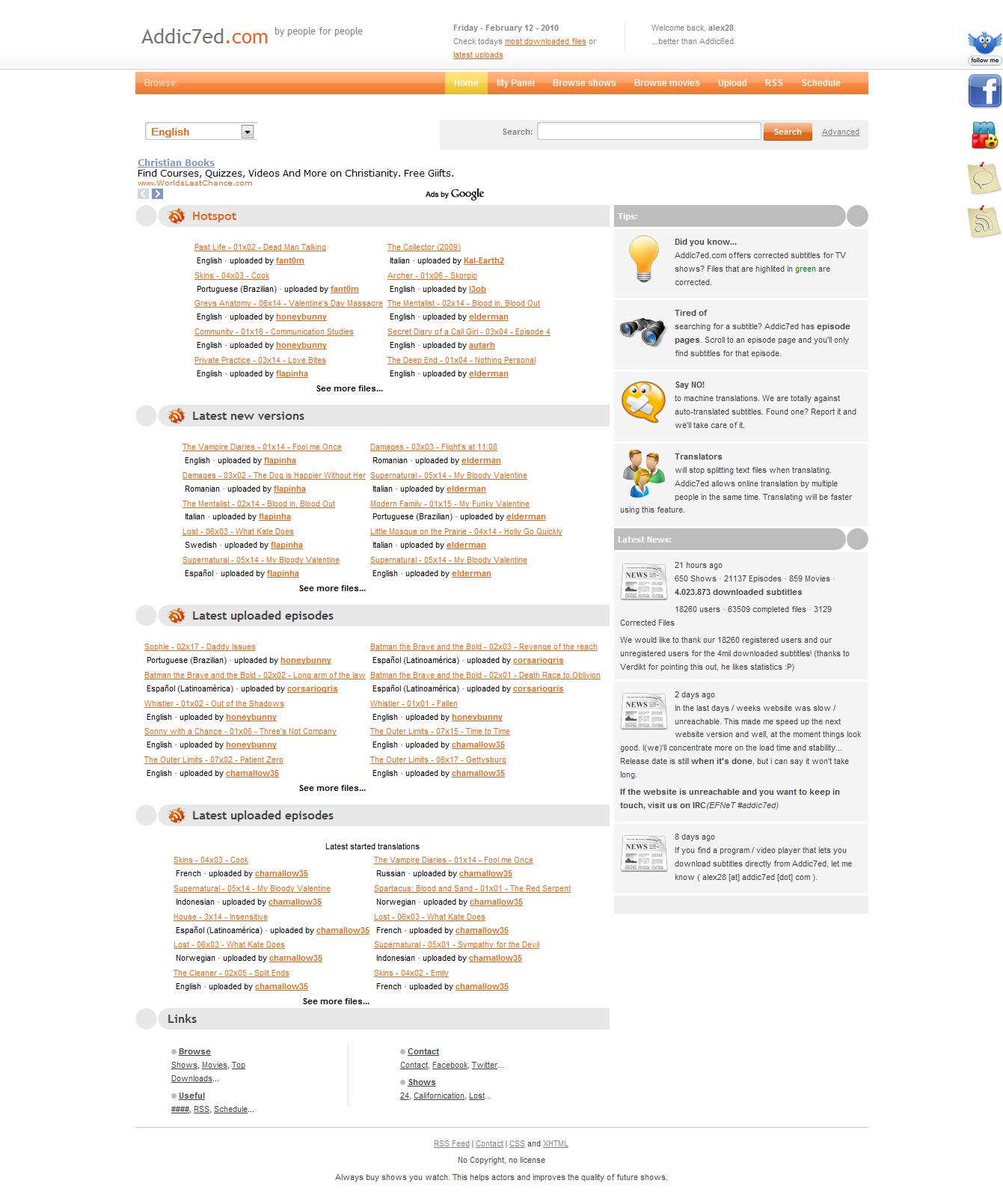
Addic7ed doubles this figure with its fancy 198KB, 1341×1609 icon. Very strange design by the way.
Addic7ed’s… iconAddic7ed’s icon with iOS best effort
The winner in this category is ClipHunter with its 631KB icon! Sure, the drawing deserves all its bits (not safe for work, really).
But the most disappointing icon is probably Apple’s. With 96KB, the message is clear: buy an iPhone 5 and upgrade your plan to 4G.
Conclusion
Among the apple-touch-icon.png pictures that follow the dimensions of Apple specifications, 85% of them stick to the old versions of iOS. Only 15% follow iOS 7, released 6 months ago. Apparently, webmasters are not in a hurry to update them.
The overall results are positive, with only 32% of picture with undocumented dimensions. Even if these dimensions are sometimes surprising, most of them are processed correctly by iOS. Yet some sites should definitely update their icons.
Maybe the most striking figure is the amount of different sizes encountered during this study: 60 different resolutions were found, from the popular 57×57 to the unique 110×110 of the NCAA. This number reveals how fragmented the information is. 57×57 is still broadly advertised. 114×114 has its fans. 129×129 was popular for a while…
When creating an Apple touch icon, you should use an up-to-date favicon generator (and now let’s see if auto-promotion is efficient). You probably don’t bother checking Apple specifications every so often. Fortunately, some people do it for you. To make sure your favicon stays relevant, you can follow us (Twitter, Google+ or Facebook) to be notified when the generated pictures and code are updated.
Favicon update is still unpractical. You can expect more in the next few weeks… stay tuned!
Methodology
The apple-touch-icon.png picture is famous but not required to enable the Apple touch icon. There are actually four ways to display this icon:
HTML declaration. For example, <link rel="apple-touch-icon" sizes="76x76" href="touch-icon-ipad.png">
Dimension-specific pictures, such as apple-touch-icon-76x76.png
As a consequence, when a web site as no apple-touch-icon.png or this picture is somewhat wrong, it may still support the Apple touch icon successfully. For example, by providing alternative pictures declared in the HTML code.
To collect data, some portions of the favicon checker were reused. The script parsed the Alexa top web sites listing and requested each site using an iPad Mini user agent to make sure it gets the mobile version of the site. Then, it tried to download apple-touch-icon.png and get its dimensions. All failures were ignored. For example, when the file is not present, some sites do not return a plain 404 error but an error page. The script failed at parsing such “picture”, yet this case was not distinguished from genuine corrupted pictures.
The 129×129 dimension, used by 49 sites, is a bit special. Apparently, it has been the dimension of the apple-touch-icon.png of Apple for a while, making it somehow “official”. Yet, I chose to consider it as non-official since there is apparently no reason for such resolution.
Oh, and in case you wonder, yes, I cleared my browser history at the end of this study. Thank you for reminding me.
If you play golf, your swing may be just okay. But when Tiger Woods is on the green, you expect the greatest performance. If you can run a 100 meters dash in less than 12 seconds, you are already good. Enters Usan Bolt and you expect less than 10 seconds. And a gold medal. Do you know how much time it takes for your car to accelerate from 0 to 60 mph? Probably not. Buy a $100,000+ sport car and this figure will obsess you.
The same phenomenon applies to websites. Whatever your expectations for your own work are, when it comes to the greatest, most visited websites, you look forward for the best design. The highest security. The greatest user experience. The smallest latency. Zero downtime. Of course, these sites must do well on all modern platforms: desktop, smartphones and tablets. And, yes, so should do their favicons.
This survey targets the first 100 top sites listed by Alexa. In this list, you find the classic gang: Google, Facebook, Youtube, Wikipedia, Amazon… Some Chinese and Russian giants: Baidu, Yandex… And many others.
The top websites are mobile-ready
No surprise. In 2014, nearly all major websites are designed with the mobile in mind. Most of them come with a “m.” version, while some others are responsive. Whatever the technical solution and the attractiveness of the result, this means one thing: the big players take the mobile seriously.
What “most” means exactly? 88%. What about the others 12%? After all, at this level of audience, we could aim for 100%. Well, a few intruders slip into the list. Take t.co, the Twitter URL shortener. While this service is extensively used across the Web, it is not a website by itself. Visit its homepage: this is just a few lines of content and a minimalist design.
All in all, there is no surprise at this level.
The favicon is stuck in the desktop era
Favicon starts with the favicon.ico file introduced by Internet Explorer. It is well-known and creating it is part of any web projects nowadays. In this respect, top websites are doing well: 98% of them exhibit a favicon for desktop browsers. This figure makes sense: favicon.ico was here before the iPhone, so even the outdated sites benefit from this old practice.
What about the mobile platforms?
The support rate for the iOS touch icon is 60%. If you bookmark or add to your home screen one of the others 40% websites, you will end up with a default icon or a “thumbnail” icon. Definitely not something you want on your Retina screen.
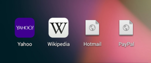
Would you rather click Ask.com or the calculator?Buy a book? Nah, let’s spend some time on Reddit.
Unlike iOS, Chrome for Android has no equivalent for the Touch icon, except two 196×196 and 128×128 pictures with very little audience for the moment. It sticks to the iOS rules to get the job done, except that is does not handle as many cases. As a consequence, Android score is mechanically lower. The score found here is 29%, which is quite low. However, this figure should be considered carefully, see the methodology below. Suffice it to says that Android support is lower than iOS.
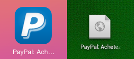
Paypal did the job for iOS, but not for Android
The last platform is Windows 8. As a challenger compared to iOS and Android, it cannot pretend to a huge support. No surprise, only 14% of the top websites define Windows 8 tiles. When Windows 8 cannot find a dedicated picture, it arranges something with the classic favicon, which is way too small to produce something good.
WordPress defines a tile picture. Not Blogger.
Let’s sum up:
Mobile support (responsive site or dedicated mobile site)
88%
Desktop favicon support
98%
iOS TOuch Icon support
60%
Android icon support
29%
Windows 8 tile support
14%
Conclusion
These results are surprising and disappointing.
Sure, there are explanations. For example, add Google.com to the home screen of your Android device. Oops! Google has no icon for its own mobile platform! Is it so important? After all, Google is so integrated to Android that it makes this use case irrelevant. Better save a few bytes in the most visited web page in the world. Some sites, like Instagram, redirect you to their native apps, making their mobile websites almost useless. No need for a mobile favicon when the visitors are invited… to never come back.
Yet, why a site like Amazon has no Touch Icon? Can the existence of an iOS app justify this? As a website, Amazon.com is doing well on an iPad or an Android phone. A clear sign that Amazon does not bet everything on its native apps. A dedicated favicon would be the natural conclusion of the investment in web design: a pleasant experience for the loyal customers who want to see a big “A” each time they turn on their device.
Maybe the big editors ignore the mobile favicon because it costs more than it’s worth. After all, in many cases, supporting mobile devices adds a few bytes to the HTML code and leads to additional picture downloads. The browsing experience may suffer because of this. But it doesn’t seem to be the way the major players think. Let’s consider the Touch Icon. 23% of the studied web sites have a apple-touch-icon.png in their root directory. This file is supposed to be a 152×152 picture. Why 152×152? Because this is the resolution needed by the iOS device with the highest screen density, a Retina iPad with iOS 7. Only two websites do this. You guessed right, one of them is Apple.com. The resolution of the pictures of the other sites is beyond the scope of this post. But you will sometimes find 57×57 images, often documented here and there on the Web as the reference for the iOS Touch Icon. Unfortunately, this information is outdated: 57×57 is the size for non-Retina iPhone running iOS 6 or prior.
In the end, top websites give the feeling to neglect their favicon. In many cases, the absence of support for iOS just doesn’t make sense. The outdated picture resolution reinforces this hypothesis.
On mobile platforms, pictures and buttons are preferred to text and typing. The favicon, used as bookmark or home screen icon, is more exposed than on desktop, where the tiny picture is mostly here to spot a browser’s tab in a blink. It is a bit awkward to note that so many major websites don’t pay enough attention to this aspect, whereas so many time and money are spent in the sites themselves.
What should top websites do? They should review Apple, Microsoft and (optionally) Google specifications. These three pages contain everything you need to know to support most iOS, Android and Windows 8 devices and browsers. Keep in mind that Android follows iOS rules, this is why Google’s recommendations can be skipped. Then, top players should investigate their requirements in term of support. Declare all iOS icons for a better support or declare only the biggest one to shorten the HTML code? Oh, they could also use a great favicon generator to fix all their issues at once. A little bit of self-promotion never hurts.
Methodology
To perform this study, I hacked the favicon checker to iterate over the top 100 list and dump the data I needed. If you tried the checker before, you noticed that it checks a lot of things and it is not very forgiving. Unless you generated your code with RealFaviconGenerator, you will probably get a warning or two. Obviously, I was not so inflexible for this study. For example, if a site had just apple-touch-icon.png in its root directory, the test was positive. Even if Apple recommends a lot of other pictures.
The checker looks for some known pictures and/or code to decide if a kind of icon is supported. For example, if apple-touch-icon.png is present, the test passes. Else, if apple-touch-icon-precomposed.png is present, the test also passes. Etc. If no rule succeeds, the test fails. This means that, if the checker lacks a rule, if might wrongly fail. In other words, although the checker should not generate wrong positives (“site abc.com support Windows 8 tiles”… whereas abc.com does not support Windows 8 tiles), it can generate wrong negatives (“site abc.com does not support iOS touch icon”… whereas abc.com supports iOS touch icon).
In order to mitigate the risk of massive error, I manually cross-checked some results I found suspicious. Apparently the checker did quite well.
Android Chrome adds some complexity to this guess-work. It mainly re-uses the iOS touch icon but it often fails at looking for conventional pictures (ie. trying to get /apple-touch-icon.png even when it is not declared in the HTML page). But not always. Therefore, it is hard to predict if a favicon will do well on Android or not. Android Chrome also looks for PNG favicon. Because these pictures are still rarely used, we can state this simple rule: Android Chrome support < iOS Safari support. For these reasons, the Android figure above should be considered “okay” but not very reliable.
Last but not least: out of the 100 top websites, only 89 were actually studied. Some “top sites” are actually “top domains”, such as akamaihd.net. Accessing http://akamaihd.net/ just doesn’t work. In addition, some of the homepages made the HTML parser failed, like Dailymail.co.uk. Such site was simply excluded. So when this post announces that 40% of the sites have no mobile favicon, it means 35 sites out of 89.


