How to create an SVG favicon

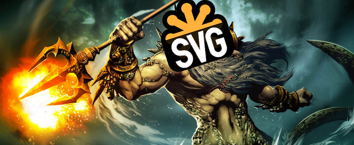
TL;RD If you are here, maybe you are just looking for the SVG favicon editor.

Major desktop browsers support the SVG favicon. And you can now create your SVG favicon with RealFaviconGenerator! But what for?

What is the SVG icon good at?

As a vector format, SVG is more flexible than raster formats such as PNG and JPG. An SVG image always looks good, whatever the screen resolution. All this with a lower file size. Great. But when talking about favicon, what’s the point? After all, desktop browsers need icons in 48×48 at most. There is no way SVG can significantly outsmart the trusty PNG for such a low resolution. So why would we want to care about yet another icon file?

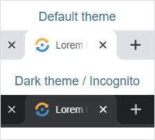
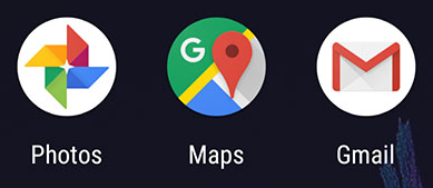
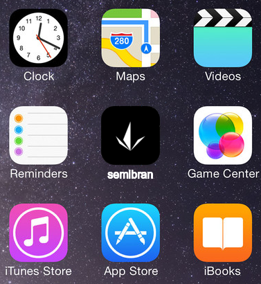
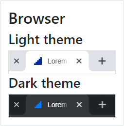
Because of dark theme support.

As pointed out by Mathias Bynens and Thomas Steiner, SVG favicon can take advantage of CSS to fit the browser’s theme. That’s pretty cool! The trick is to use the @media (prefers-color-scheme: dark) media query.

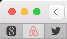
And this is not (only 😆) a fancy feature. Sometimes, the favicon just does not fit the dark mode well.

Icon is perfect for light mode but too dark in dark mode

However, this leads to another question: how to actually create a favicon for dark themes?

Dark mode in practice

To make the magic happen, we need to reconcile two worlds: image and CSS. If you have your company’s logo as an SVG file, you can quickly edit it with a drawing tool software, such as Inkscape. But what about CSS and media queries? Well, this is not their speciality.

Let’s edit the file manually, then. After all, SVG is just an XML dialect. Uh oh… I don’t know how these <path> things are made exaclty, but they are huge! An SVG is not that simple to edit after all.

In the course of building the SVG favicon editor, I had to ask myself: what would make a good dark icon? What is the transformation that acutally makes sense in this context? Of course, the solution had to be simple. I was not willing to build a full-fledge icon editor in RealFavicon. And regular users would not be willing to use it.

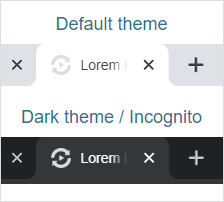
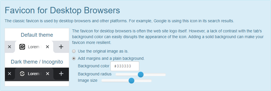
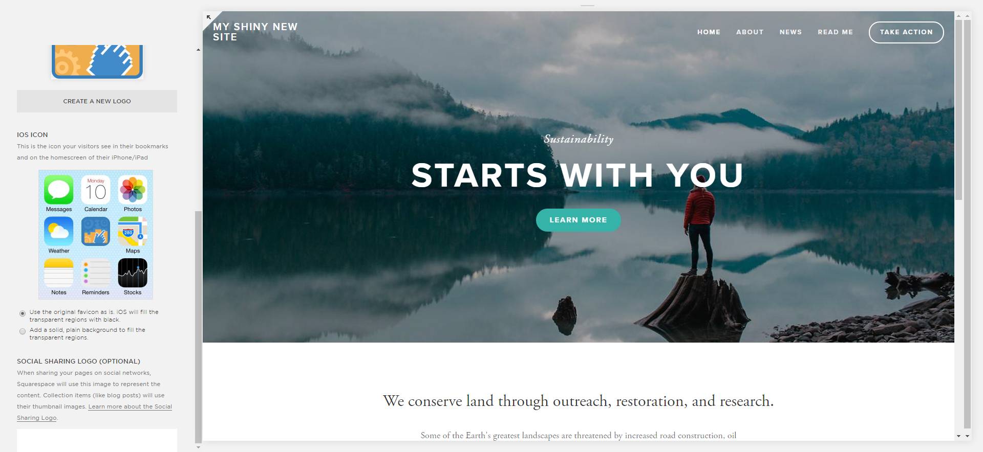
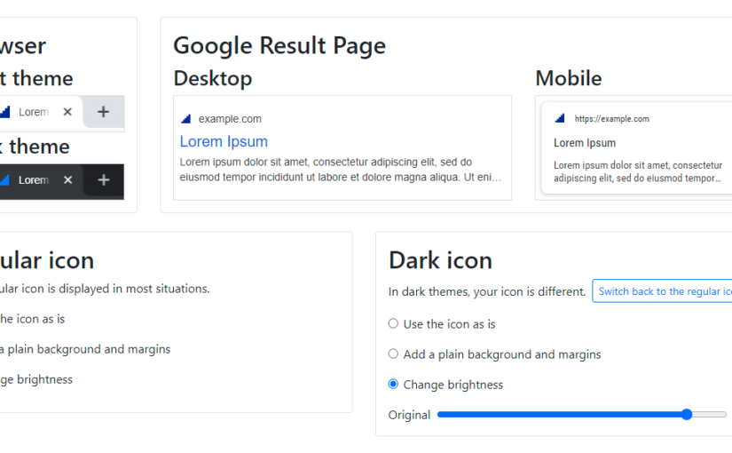
One answer I came up with is a technique I already used in the classic favicon editor: apply a solid background, as a mean to add contrast whatever the colors at work. This option as a serious drawback, though. It almost always forces you to apply padding to the original logo, so it does not “touch” the border of the newly created background. The favicon is quite small already, extra padding is not a great option.

Contrast is good, but the logo is smaller in dark mode

Your logo is your logo and you have no reason to change it when switching to dark mode. The only (legit) reason you would like to change it is if the logo is quite dark itself. The solution? More brightness. Good news, the CSS for this is simple and universal:

@media (prefers-color-scheme: dark) {
	:root {
		filter: brightness(2);
	}
}

The code is straightforward. When the theme is dark, apply a brightness filter to the root element. The only trick is the brightness factor, which must be chosen by trial and error. This is what the editor is made for!

The original logo, just brighter

The code is straightforward. When the theme is dark, apply a brightness filter to the root element. The only trick is the brightness factor, which must be chosen by trial and error. This is what the editor is made for!

I hope the SVG favicon editor will change the favicon landscape the way RealFavicon’s classic editor did when is was issued almost 8 years ago!

Favicon Editor for Desktop Browsers

Here it is. The long awaited favicon editor for desktop browsers is available.

While RealFaviconGenerator has been offering editors for iOS and Android from day 1, our beloved desktop browsers have been strangely neglected. This dark age is over and desktop icons are now treated as first class citizens.

But what is it useful for?

It’s about contrast

Desktop icons are so small. Once your website logo is ready, is there anything left to edit?

Why would you change anything?

Sometimes, the answer is yes. Definitely. And the editor does you a first favor by letting you know. Consider this perfectly fine light grey logo:

Light grey is good

Did you realize the logo would be barely noticeable in browser tabs? Now you do:

The desktop editor would only be a previewer if it would stop here. With a few clicks, you can add a solid background and get the job done in seconds:

Logo visible again

I hope you will enjoy the favicon editor for desktop browsers. Please tell me what you think!

In-browser mining with JSECoin – Experiment and feedback

Monetization matters. Whatever you are YouTube or the proud admin of a small site, you need at least to get your hosting fees back. Chances are that you also want a little more. A beer, a new phone or a living.

On RealFaviconGenerator, I made a few experiments, with ads, donations… The last attempt to date is in-browser mining with JSECoin. I led an experiment for 16 days, where 10% of RealFaviconGenerator visitors were presented the possibility to mine JSECoin from their browser.

Acceptance

The message was quite bold… and wrong, since JSECoin actually displays an opt-in banner:

The goal of the wording was to not trigger kindness-biased feedback. Quite the contrary, if someone was not happy with in-browser mining, I wanted to hear him shout, not whisper.

By clicking the “Answer 2-3 questions” button, the user was presented a short survey:

The first question was about speed. Cryptocurrency mining is tied to processing power. The more power you engage, the more chances you have to mine the next block and get the miner reward. So in-browser mining carries the risk to slow down the visitors PC for the sake of performance. I wanted to know if the user experience was impacted.

82% of respondents said they didn’t notice anything. That leaves 18% of unhappy users, though.

What about the feeling of the visitors? They were presented 4 choices:

  • Fine with background in-browser mining, without any notification. In other words, you don’t know it takes place and you can’t opt-out. I’m personally not fine with this setting, but I wanted to know. Plus, again, this aggressive proposal was on purpose. 14% respondents choose this answer.
  • Opt-out. Mining starts automatically and you can easily choose to stop it if you want to. 45%.
  • Opt-in. You need to click a button in order to start mining. 26%.
  • Definitely don’t want in-browser mining. 15%. Unfortunately, I couldn’t get feedback about why people rejected the idea when opt-in sounds like a reasonable option. Maybe this is because of the wording, and if so this is good.

So far, the results are rather positive. Opt-in is my preferred setting and it appears that most people agree with this. The slowness observed by nearly 1/5 of visitors is not an issue anymore as soon as mining has been explicitly turned on, and can be as easily turned off.

Money $$$ 😉

Next question is: when will I retire to a heavenly island? 🙂

TL;DR : not any soon.

JSECoin is not your regular cryptocurrency. Finding a valid hash is quite easy. Self-mine in JSECoin and the “hash found” counter grows regularly. But unlike BitCoin and the other ones, finding a hash only grants you a ticket to a lottery. This lottery takes place every 30 seconds and awards 1 JSE to 50 winners. And because you can get a single ticket per round, there is no need to mine a lot. You only need to mine enough (enough to find a hash often, ideally one per 30 seconds).

Alright, how many JSE did I get? Around 3000. This is less than 200 JSE/day. This token is not yet listed on your regular crypto platform, so it’s hard to know how much it’s worth. But ICO price was 200 JSE for $1. As of today, this is not a great deal. As always with token, there is a special factor: speculation. What is worth $1 today may become $10, $100… or $0.

Maybe I’ll come back to JSE later. Right now, I’m testing ads again.

The United SVG Favicon Myth

In 1999, a single favicon.ico was all it used to take to have a full-fledged favicon. Life was good. Almost 20 years later, RealFaviconGenerator creates 10 files for the very same task. It used to be a lot more. Whatever it is on Twitter or StackOverflow, people are wondering if this figure could be lowered. And suggest the obvious solution: a single SVG image.

This idea is not as good as it sounds.

Why you want a united SVG image

The case for a single SVG image is straightforward.

Creating a single image is easier and faster than building eight of them or more. Actually, if the logo of the company already exists as a square SVG image, you can use it as is. Look Ma, no dedicated favicon image!

In the event of a logo change, all copies must be updated. Multiple copies of the same logo make the process error prone, although tools such as plugins for WordPress, Gulp or Ruby on Rails reduce the pain. But a unified image cannot be challenged.

SVG images are compact. Take RFG own favicon images. The GZIPed SVG is only 2.23KB, slightly less than the 32×32 PNG icon (2.34KB) and clearly lighter than the Touch icon (11.8KB). Only the 16×16 PNG outperforms it, with the ridiculous size of 1.22KB.

And finally, as a software engineer, I value the idea of a single file. DRY and all.

Why you shouldn’t want a united SVG image

Because of design.

iOS vs Android

Let’s compare iOS and Android. The home screen icons of iOS are opaque squares with rounded corners. These are not guidelines but rules enforced by iOS: it rounds the corners itself and fills transparent regions with black. For example, if the RFG logo is used as is as a touch icon, its corners are rounded by iOS and the result is rather poor (in particular for the bottom corners):

You’d better make sure your touch icon complies to iOS way of doing things.

Now, Android. Unlike iOS, Android has no enforced restrictions. Even when it transforms your icon, it makes sure to not break it. Good. You can re-use your touch icon as is and Android will handle it nicely.

But this is not the end of the story. Although Android plays the nice guy with icons, it clearly has opinions about them. Android 8 is in adaptive icons, with icons of various shapes, depending on the device. Take this screenshot:

Here Android enforces round icons. The Google Maps icon was designed especially to match this criteria and is thus displayed as is. Photos and Gmail are not round so Android transform them and the result is good looking. But neither Photos nor Gmail original icons are opaque squares. They make use of transparency to match their respective logo shapes. This is not new. Back to Android 6, Google native app icons were already coming in all shapes but square.

Conclusion: for optimal results and seamless integration in iOS and Android, you should prepare two icon designs. Not one.

As an example, this is what Brandon Semilla did:

iOS, Android, macOS…

Different designs, alright. How many?

iOS

As discussed above, opaque image with corners that can be rounded without breaking the design.

1 design.

Android

Already raised above. Plain logo with transparent background.

2 designs.

macOS Safari

Although Safari dropped the favicon in regular tabs, it introduced the mask icon for pinned tabs.

This is a monochromatic SVG icon, which Safari fills with grey when the tab is inactive or with a custom color when active.

Does this icon require a particular design? Well, it can be automatically derived from the original icon if:

  • The logo is a natural silhouette
  • It has a clearly dominant color

For example, designers from Airbnb must not have brainstormed for hours about their pinned tab icon:

The demo image of RealFaviconGenerator can be turned into a silhouette automatically, too. But its blue-and-yellow style makes the color choice a design decision:

Often the silhouette also requires a decision. RealFaviconGenerator logo has no natural silhouette:

3 designs.

Windows / Metro

Whatever you call it “Windows pinned site icon”, “Windows start menu icon” or “Windows Surface icon”, a site can come with an icon for the Metro UI style introduced by Microsoft with Windows Phone 7 and later with Windows 8 (classic/desktop and RT).

The icon can fill the tile (starting from Windows 8.1) or come with a background color. In the first case, the touch icon for iOS can do the trick. In the later case, the problem is similar to the one already described with macOS Safari pinned tab. Plus you might consider using a color from the “Microsoft palette”, ie. one already used by native Windows apps.

Because Windows builtin app icons are white silhouettes, you might want to choose this route, too.

4 designs.

Classic desktop design

The only requirement for the desktop favicon is to look good despite of its small size. Most of the time, the web site logo works just great. But sometimes it doesn’t fit the small, square space allocated to the favicon.

For example, ebay’s logo is used as is as the Touch icon:

For the desktop version, a totally new design was created:

Possibly 5 designs.

Conclusion

Yes, the time a single file was enough to implement the favicon is long gone. The same applies to fixed resolution web sites. Remember when web sites shameless used to introduced themselves with “Best viewed in 1024×768”? Favicon did not become (that) more complex. Platforms did.

Alright, RFG still generates 10 files, there is definitely room for improvement 🙂

How Android 8 Oreo processes your home screen icon

Android 8 Oreo brings some changes regarding the Add to Home screen feature. One of them is that it makes your icon fit a circle no matter what.

Android expects your icons to fit in a circle. For example, these icons:

A circle with a transparent background

A square icon (no transparency)

Become:

What happens if the icon is a little “more” than a circle? There is a slight tolerance. When editing a 192×192 icon, the circle can be extended up to 2 pixels:

Beyond this, Android resizes the icon to make it fit:

Oh, and there are apparently no low limit. As long as your image fits in a circle, Android does not edit it:

RealFaviconGenerator brings the best Facebook meta editor to Yoast SEO

You know Yoast. This is one of the first plugins you installed in your WordPress blog. This module comes with a stunning set of options to make your site SEO-friendly.

Yoast gives your the ability to setup the way your posts will look like once shared via Facebook.

Share on Facebook

In its free version, Yoast SEO offer a simple form where you can type the post title and description, and submit an image. It is basic but straightforward.

Yoast (Free) - Facebook editor

In its Premium version, Yoast let you see in real time how your post will look like in the Facebook newsfeed. Until a few months ago, that was the best solution in the market.

Social by RealFaviconGenerator replaces Yoast’s Social editor.

RealFaviconGenerator integrated into Yoast SEO

What does it add?

  • Preview for desktop, Android and iPhone – Your post will likely appear on Facebook native mobile apps, so better know how your post will be displayed on these platforms.
  • Pixel precise preview – The editor is using the same fonts and styles as Facebook clients. It also replicates their policy regarding title/description cropping. So you know what your visitors friends will see (or not).
  • Edit the image – You can zoom in/out and move the image. So you are in control of the post appearance.
  • Choose between the various formats – Did you know Facebook can display you posts with a square image? A tall image?

Now Yoast and Social by RealFaviconGenerator form the perfect duo for SEO and social optimization for WordPress.

Major sites that think they have their Facebook image right but don’t

The Facebook Open Graph image is the image linked to a web page and displayed by Facebook in the news feed when the said page is shared:

Open Graph image example

This image has special requirements, in particular its dimensions. We already saw that many web sites did it wrong. What about the biggest web sites, the ones everyone know? This article focuses on the Alexa’s 500 worldwide top sites.

The results

65% of the top sites have no Open Graph image. As simple as this. You could expect such sites to be at the bottom of the list, but actually even the first ones lack of it:

Wikipedia - No Facebook Open Graph image
Wikipedia – No Facebook Open Graph image

LinkedIn - No Facebook Open Graph image
LinkedIn – No Facebook Open Graph image

Reddit - No Facebook Open Graph image
Reddit – No Facebook Open Graph image

What about the remaining 35%? Well, 8% don’t match Facebook ratio requirements. For example, Vimeo is using an image which is roughly 5:3.

Vimeo Open Graph image

Facebook expects 19.1:10, so it crops 13% of it to make it fit its news feed:

Vimeo Open Graph image cropped by Facebook

Vimeo on Facebook
Vimeo on Facebook

Some other sites have the ratio right, but the images are too big. This is not documented anywhere, but when Facebook gets a small square picture, it displays it as is in the news feed. But when the image is big, Facebook processes it as a wide image. 7% of the top sites fall in this trap. Among them, YouTube (the 2nd most visited web site in the world) and Amazon:

YouTube Open Graph image

Amazon Open Graph image and on Facebook

Conclusion

That leaves us with only 20% of sites that:

  • Have an Open Graph image for Facebook
  • Have a ratio Facebook knows
  • Have the image displayed as is and not cropped by Facebook

Results

Suffice it to say that this result is rather poor.

In one hand, one could think that YouTube homepage sharing is not that important. After all, what is heavily shared across Facebook are YouTube videos (and this part is done right). In the other hand, we need to consider that someone at YouTube created an image for the second most visited website in the world, and this image is not that great. And 80% of the top sites are more or less in this situation.

Thank’s to Meta Chart for the neat online tool!

Why does the Favicon by RealFaviconGenerator WordPress plugin need to be activated all the time?

Here is how to use the Favicon by RealFaviconGenerator WordPress plugin:

  • Install and activate the plugin
  • Go to Appearance > Favicon
  • Design and setup the favicon. Well done!
  • Forget about it

Now, it is tempting to say “Hey, the mission of the plugin is completed. Let’s deactivate it”. Bad move. The plugin needs to be active all the time.

Granted: most of the work is done at creation time, when the favicon is setup. However, the plugin has something to do every time to fulfill its purpose: it must inject special HTML markups in all pages served by WordPress. This is done dynamically. In other words, each time a visitor views a page of your site, Favicon by RealFaviconGenerator is triggered and sends him the favicon markups.

“Wait, doesn’t it slow down my site?” you are wondering. Don’t worry, the plugin was designed to be extremely lightweight and does not affect the performance of WordPress.

If you ever install a favicon manually in WordPress, you may have edited a file called header.php. So you may wonder why the plugin does not behave in a similar fashion. Modifying header.php is actually a bad practice. The major issue is a theme switch. Because header.php comes from the current theme, it is changed whenever you change or update your theme. This is when things start to be messy and you wish your plugins had a better, modular design.

We aim at providing the best experience for favicon on WordPress. If you have questions, please leave us a comment.

Website builders and their lame favicon support

What is the easiest way to setup a good-looking, efficient website? Use a website builder. In a matter of hours, you can create a compelling website and go live.

How good are these websites on mobile? Excellent, actually. Major website builders use responsive templates.

1&1 templates are presented in desktop and mobile configurations

And you probably expect the favicon support to be as great as the templates themselves. Oh, my sweet summer child…

You won’t have anything but the plain old, desktop favicon

For this research, we analyzed 6 website builders and focused on their demos sites:

Long story short: all of them support the basic, old school favicon for desktop browsers. And none of them have anything more to offer, with the exception of Strikingly. It is interesting to look at their solution:

Strikingly "favicon editor"
Strikingly “favicon editor”

On the right, the favicon itself. Upload an image et voilà! Fair enough. On the right, an image labeled “Social Share Image”. The image here actually serves two purposes:

  • Facebook Open Graph image
  • Apple Touch icon

These two images are supposed to be completely different. They should have different dimensions and content.

And this is the best solution around.

Website builders have no favicon for modern platforms

Alright, users cannot create icons for all platforms. It is interesting to note that website builders have not even setup their own homepage: all come with classic desktop icon, nothing more:

The exception here is Squarespace, which has its own Apple Touch icon (for some reasons, it is ill-declared: the 180×180 is declared as the 152×152 icon, etc.).

How to fix

The major issue here is the gap between website design (excellent) and favicon support (minimalist). With the iPhone celebrating its 10th anniversary this year, users can expect an full-fledged favicon support, not only the one that was okay at least 4 years back.

Hum… What if the website builders could leverage the power of RealFaviconGenerator to finally offer to their users the solution they deserve? Wait a minute, we are working on it right now and we call it favicon web components! This is how website builders could look like:

Wix + RealFaviconGenerator

Weebly + RealFaviconGenerator

Squarespace + RealFaviconGenerator

Jimdo + RealFaviconGenerator

Facebook Open Graph image: You’re (probably) doing it wrong

If you use Facebook, you must be used to this kind of thing in your news feed:

Facebook Open Graph Image example

Someone (a friend maybe) shared some content and here you are with a title, a description, a link to click. And an image. This image is important because it has the power to grab the attention and generate visits.

This image is usually provided by the shared page, via specific HTML markups. Facebook sticks to the Open Graph specifications and adds a few more requirements, for example regarding the image dimensions.

For many sites, like blogs, the Open Graph image should be a classic, along with the page title and description. Facebook is often of critical importance to generate traffic. Is the Open Graph image correctly created?

An issue (among others)

To answer this question, let’s focus on a particular point. Facebook displays 19.1:10 images in its news feed (eg. 1200×630, because 1200/630=1.905; close enough). When it finds an image of another ratio, it automatically crops it to turn it to 19.1:10.

For example, let’s consider this 540×619 image:

crop_example_1

When the related page is posted to Facebook, the image becomes:

crop_example_2

It is easy to understand how Facebook proceeds. It simply crops the image as much as necessary to make it 19.1:10. To do so, it normally removes the same amount of border on each side to keep the center of the image:

crop_example_3

Now the deal is clear: if you don’t provide a 19.1:10 image to Facebook, it will be cropped automatically. Which can be okay or plain wrong, depending on the image. Take this NCB News article about Macy’s. Its Open Graph image is:

share_planned_3

We can clearly see the name “Macy’s” and the showcase, so this is probably a good photo to illustrate the article. However, when shared on Facebook, the outcome is rather poor:

share_actual_3

“Macy’s” was entirely stripped and the photo is now quite dark.

Open Graph image in the wild

To investigate how the Open Graph images are prepared, 40 sites were selected, 10 in each of the following categories:

  • News sites (Yahoo News, CNN, etc.): They are high traffic sites everyone know. Facebook can be a major source of traffic for these sites, so they are likely to pay attention to the Open Graph images.
  • Tech blogs (TechCrunch, Mashable…): Same as news sites, plus they are tech-related. Can’t be wrong!
  • Blogs about WordPress (WPTavern, wplift…): As WordPress-related blogs, they must know about the right tools to have everything right, including Open Graph images.
  • Social Media blogs (Buffer blog…): Because social media is their core business, they must be especially careful with Facebook-related material.

Results (**drum roll**)

And now, the shocking truth: out of these 40 sites, only 3 are doing it right. Hat off to TechCrunch, Mashable and the New York Times. The later must have a dedicated tool or process for this, because its Open Graph images not only have the right dimensions, they are also cropped manually. I have no strong opinion about TechCrunch and Mashable but I suspect them to auto-crop the images, making the process less relevant: the goal is to do it manually in order to achieve the best result. Not to leave this to an automated tool.

What about the other sites?

Out of 40 sites, only one does not have any image (ITBusinessEdge). All the others come with an og:image markup. This is the sign that web site editors have plans for the Facebook metadata.

However, things are not that crisp when going into the details: 36 sites do not follow Facebook requirements and are exposed to auto-crop.

The next question is “how much?”. After all, removing a single row of pixels cannot hurt. On average, 13% of the surface of the analyzed images is cropped. This is significant, especially from high traffic and/or specialized sites.

Some sites seem to have no particular policy regarding Open Graph image dimensions. For example, on WPTavern, out of 10 posts, the average cropped surface is 18%, with a standard deviation of 14% (and a maximum of 41%). I suspect this is because the featured image (a term WordPress users should be familiar with) is used as the Open Graph image as is. This pattern must be encountered very often.

Some other sites apparently have a “fixed dimensions” policy, but ones that are not accurate. Both CNN and NBC News always expose the same image size. CNN has a systematic 7% of cropped surface, 21% for NBC News. The sad winner is HowToGeek with 43%. The Open Graph images are actually so small that Facebook ignores them and rather picks images right from the shared pages.

Conclusion

This small study shows how sites handle Facebook sharing: they support Facebook, but they do not support it well. This is the purpose of the new RealFaviconGenerator Facebook metadata editor: do it, and do it perfectly.

And for those who know what RealFaviconGenerator is in the first place, you probably recognize the pattern: a few years ago, favicon generation was very poorly addressed. But folks were used to it. Once RealFaviconGenerator came in with the favicon editor the community deserved, the expectations started to change and nowadays everybody want “all the icons”. And the smarter among them use RealFaviconGenerator 🙂

Methodology

The tested sites were obtained by googling something like “most popular news sites” and picking the first sensible list. In the end, the tested sites are not guaranteed to be the most relevant, but the outcome should be good enough.

Then, for each tested site, a sample post was randomly picked (eg. a news site headline article, a WordPress blog latest post, etc.).

News Sites

Tech Sites

Blogs about WordPress

Social Media Sites