The United SVG Favicon Myth
In 1999, a single favicon.ico was all it used to take to have a full-fledged favicon. Life was good. Almost 20 years later, RealFaviconGenerator creates 10 files for the very same task. It used to be a lot more. Whatever it is on Twitter or StackOverflow, people are wondering if this figure could be lowered. And suggest the obvious solution: a single SVG image.
This idea is not as good as it sounds.
Why you want a united SVG image
The case for a single SVG image is straightforward.
Creating a single image is easier and faster than building eight of them or more. Actually, if the logo of the company already exists as a square SVG image, you can use it as is. Look Ma, no dedicated favicon image!
In the event of a logo change, all copies must be updated. Multiple copies of the same logo make the process error prone, although tools such as plugins for WordPress, Gulp or Ruby on Rails reduce the pain. But a unified image cannot be challenged.
SVG images are compact. Take RFG own favicon images. The GZIPed SVG is only 2.23KB, slightly less than the 32x32 PNG icon (2.34KB) and clearly lighter than the Touch icon (11.8KB). Only the 16x16 PNG outperforms it, with the ridiculous size of 1.22KB.
And finally, as a software engineer, I value the idea of a single file. DRY and all.
Why you shouldn't want a united SVG image
Because of design.
iOS vs Android
Let's compare iOS and Android. The home screen icons of iOS are opaque squares with rounded corners. These are not guidelines but rules enforced by iOS: it rounds the corners itself and fills transparent regions with black. For example, if the RFG logo is used as is as a touch icon, its corners are rounded by iOS and the result is rather poor (in particular for the bottom corners):
You'd better make sure your touch icon complies to iOS way of doing things.
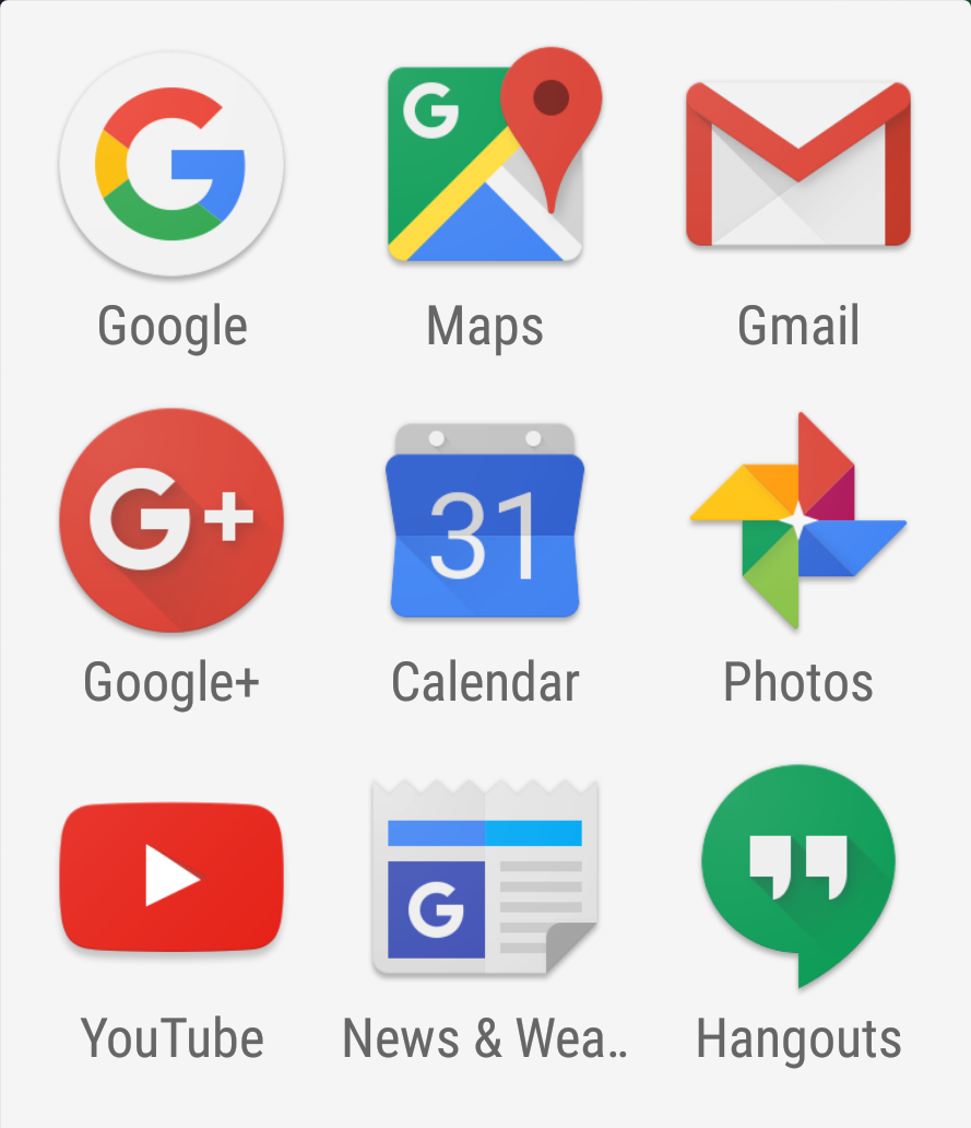
Now, Android. Unlike iOS, Android has no enforced restrictions. Even when it transforms your icon, it makes sure to not break it. Good. You can re-use your touch icon as is and Android will handle it nicely.
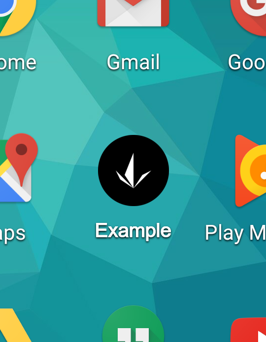
But this is not the end of the story. Although Android plays the nice guy with icons, it clearly has opinions about them. Android 8 is in adaptive icons, with icons of various shapes, depending on the device. Take this screenshot:
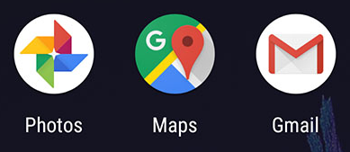
Here Android enforces round icons. The Google Maps icon was designed especially to match this criteria and is thus displayed as is. Photos and Gmail are not round so Android transform them and the result is good looking. But neither Photos nor Gmail original icons are opaque squares. They make use of transparency to match their respective logo shapes. This is not new. Back to Android 6, Google native app icons were already coming in all shapes but square.
Conclusion: for optimal results and seamless integration in iOS and Android, you should prepare two icon designs. Not one.
As an example, this is what Brandon Semilla did:
iOS, Android, macOS...
Different designs, alright. How many?
iOS
As discussed above, opaque image with corners that can be rounded without breaking the design.
1 design.
Android
Already raised above. Plain logo with transparent background.
2 designs.
macOS Safari
Although Safari dropped the favicon in regular tabs, it introduced the mask icon for pinned tabs.
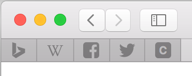
This is a monochromatic SVG icon, which Safari fills with grey when the tab is inactive or with a custom color when active.
Does this icon require a particular design? Well, it can be automatically derived from the original icon if:
- The logo is a natural silhouette
- It has a clearly dominant color
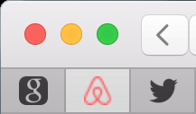
For example, designers from Airbnb must not have brainstormed for hours about their pinned tab icon:
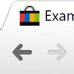
The demo image of RealFaviconGenerator can be turned into a silhouette automatically, too. But its blue-and-yellow style makes the color choice a design decision:
![]()
Often the silhouette also requires a decision. RealFaviconGenerator logo has no natural silhouette:
![]()
3 designs.
Windows / Metro
Whatever you call it "Windows pinned site icon", "Windows start menu icon" or "Windows Surface icon", a site can come with an icon for the Metro UI style introduced by Microsoft with Windows Phone 7 and later with Windows 8 (classic/desktop and RT).
The icon can fill the tile (starting from Windows 8.1) or come with a background color. In the first case, the touch icon for iOS can do the trick. In the later case, the problem is similar to the one already described with macOS Safari pinned tab. Plus you might consider using a color from the "Microsoft palette", ie. one already used by native Windows apps.
Because Windows builtin app icons are white silhouettes, you might want to choose this route, too.
4 designs.
Classic desktop design
The only requirement for the desktop favicon is to look good despite of its small size. Most of the time, the web site logo works just great. But sometimes it doesn't fit the small, square space allocated to the favicon.
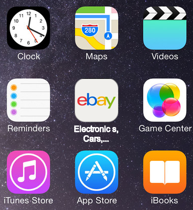
For example, ebay's logo is used as is as the Touch icon:
For the desktop version, a totally new design was created:
Possibly 5 designs.
Conclusion
Yes, the time a single file was enough to implement the favicon is long gone. The same applies to fixed resolution web sites. Remember when web sites shameless used to introduced themselves with "Best viewed in 1024x768"? Favicon did not become (that) more complex. Platforms did.
Alright, RFG still generates 10 files, there is definitely room for improvement :)