Facebook Open Graph image: You're (probably) doing it wrong
If you use Facebook, you must be used to this kind of thing in your news feed:

Someone (a friend maybe) shared some content and here you are with a title, a description, a link to click. And an image. This image is important because it has the power to grab the attention and generate visits.
This image is usually provided by the shared page, via specific HTML markups. Facebook sticks to the Open Graph specifications and adds a few more requirements, for example regarding the image dimensions.
For many sites, like blogs, the Open Graph image should be a classic, along with the page title and description. Facebook is often of critical importance to generate traffic. Is the Open Graph image correctly created?
An issue (among others)
To answer this question, let's focus on a particular point. Facebook displays 19.1:10 images in its news feed (eg. 1200x630, because 1200/630=1.905; close enough). When it finds an image of another ratio, it automatically crops it to turn it to 19.1:10.
For example, let's consider this 540x619 image:

When the related page is posted to Facebook, the image becomes:

It is easy to understand how Facebook proceeds. It simply crops the image as much as necessary to make it 19.1:10. To do so, it normally removes the same amount of border on each side to keep the center of the image:

Now the deal is clear: if you don't provide a 19.1:10 image to Facebook, it will be cropped automatically. Which can be okay or plain wrong, depending on the image. Take this NCB News article about Macy's. Its Open Graph image is:
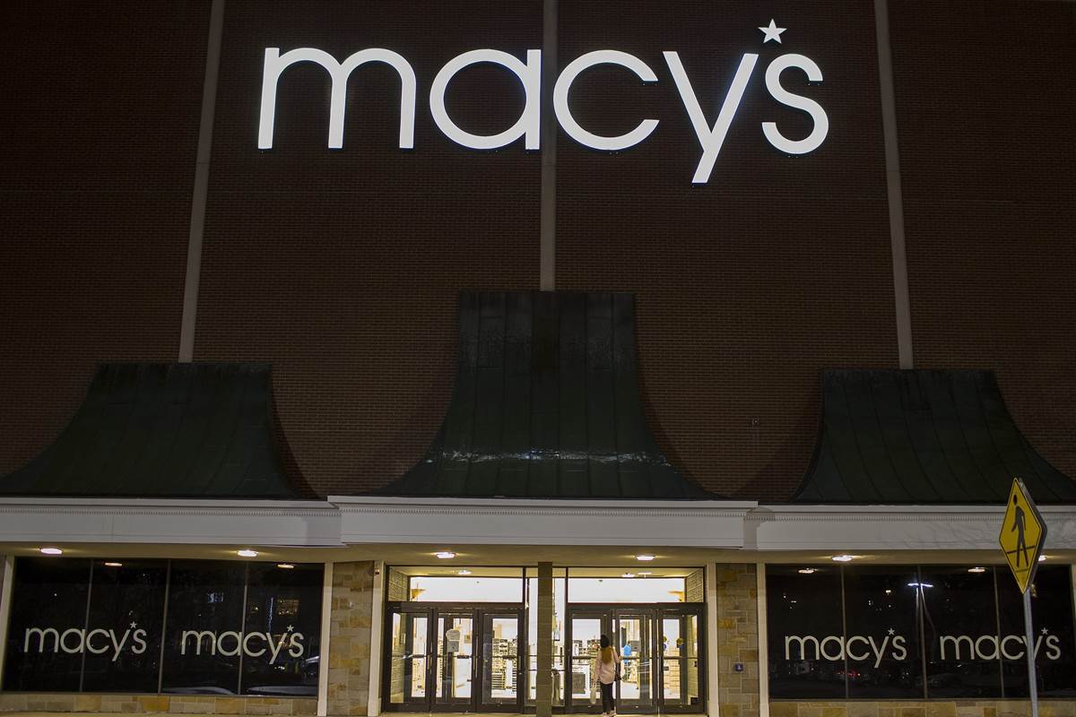
We can clearly see the name "Macy's" and the showcase, so this is probably a good photo to illustrate the article. However, when shared on Facebook, the outcome is rather poor:
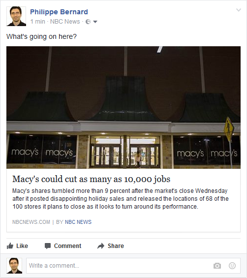
"Macy's" was entirely stripped and the photo is now quite dark.
Open Graph image in the wild
To investigate how the Open Graph images are prepared, 40 sites were selected, 10 in each of the following categories:
- News sites (Yahoo News, CNN, etc.): They are high traffic sites everyone know. Facebook can be a major source of traffic for these sites, so they are likely to pay attention to the Open Graph images.
- Tech blogs (TechCrunch, Mashable...): Same as news sites, plus they are tech-related. Can't be wrong!
- Blogs about WordPress (WPTavern, wplift...): As WordPress-related blogs, they must know about the right tools to have everything right, including Open Graph images.
- Social Media blogs (Buffer blog...): Because social media is their core business, they must be especially careful with Facebook-related material.
Results (**drum roll**)
And now, the shocking truth: out of these 40 sites, only 3 are doing it right. Hat off to TechCrunch, Mashable and the New York Times. The later must have a dedicated tool or process for this, because its Open Graph images not only have the right dimensions, they are also cropped manually. I have no strong opinion about TechCrunch and Mashable but I suspect them to auto-crop the images, making the process less relevant: the goal is to do it manually in order to achieve the best result. Not to leave this to an automated tool.
What about the other sites?
Out of 40 sites, only one does not have any image (ITBusinessEdge). All the others come with an og:image markup. This is the sign that web site editors have plans for the Facebook metadata.
However, things are not that crisp when going into the details: 36 sites do not follow Facebook requirements and are exposed to auto-crop.
The next question is "how much?". After all, removing a single row of pixels cannot hurt. On average, 13% of the surface of the analyzed images is cropped. This is significant, especially from high traffic and/or specialized sites.
Some sites seem to have no particular policy regarding Open Graph image dimensions. For example, on WPTavern, out of 10 posts, the average cropped surface is 18%, with a standard deviation of 14% (and a maximum of 41%). I suspect this is because the featured image (a term WordPress users should be familiar with) is used as the Open Graph image as is. This pattern must be encountered very often.
Some other sites apparently have a "fixed dimensions" policy, but ones that are not accurate. Both CNN and NBC News always expose the same image size. CNN has a systematic 7% of cropped surface, 21% for NBC News. The sad winner is HowToGeek with 43%. The Open Graph images are actually so small that Facebook ignores them and rather picks images right from the shared pages.
Conclusion
This small study shows how sites handle Facebook sharing: they support Facebook, but they do not support it well. This is the purpose of the new RealFaviconGenerator Facebook metadata editor: do it, and do it perfectly.
And for those who know what RealFaviconGenerator is in the first place, you probably recognize the pattern: a few years ago, favicon generation was very poorly addressed. But folks were used to it. Once RealFaviconGenerator came in with the favicon editor the community deserved, the expectations started to change and nowadays everybody want "all the icons". And the smarter among them use RealFaviconGenerator :)
Methodology
The tested sites were obtained by googling something like "most popular news sites" and picking the first sensible list. In the end, the tested sites are not guaranteed to be the most relevant, but the outcome should be good enough.
Then, for each tested site, a sample post was randomly picked (eg. a news site headline article, a WordPress blog latest post, etc.).
News Sites
- Yahoo News
- Huffington Post
- CNN
- New York Times
- Fox News
- NBC News
- Daily Mail
- Washington Post
- The Guardian
- Wall Street Journal
Tech Sites
- Mashable
- Gizmodo
- Gigaom
- ZDNet
- TechCrunch
- Computer World
- Google blogs
- Engadget
- HowToGeek
- IT Business Edge