Welcome, Android Chrome!
From the beginning, RealFaviconGenerator supports Android Chrome. Well, that was minimum service. Sure, the required icon was generated, but that was all. In particular, there was no "RealFaviconGenerator's touch", which is the ability to design an icon for that particular platform. Your master picture was used as is by Android.
Until now. RFG now provides full support for Android Chrome.

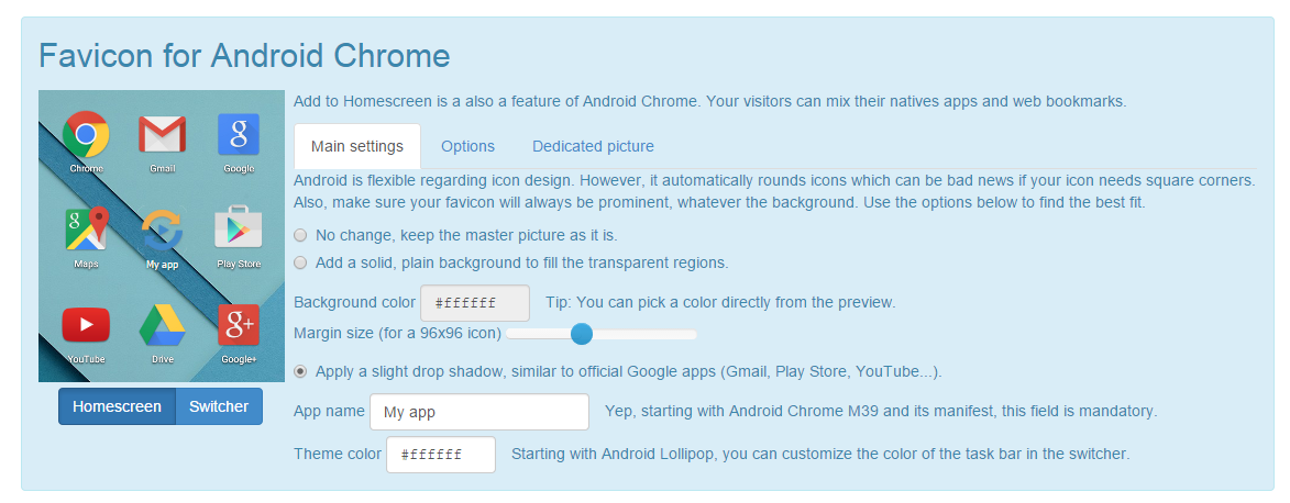
The icon editor is familiar: a set of sensible settings are offered so you can get the best of your icon and make is fit any Android device home screen:
- Use the icon as it is. Easy one.
- Apply margins and an opaque background. Classic. This one is especially useful when you have a picture with square corners. Because Android crops them, adding margins is a great workaround to keep the precious corners.
- Drop shadow. Why a drop shadow? To copy Google. Look at the official Google apps: Gmail, Youtube or Chrome itself. They all have a thin drop shadow. You can make your icon stand out with the same effect.
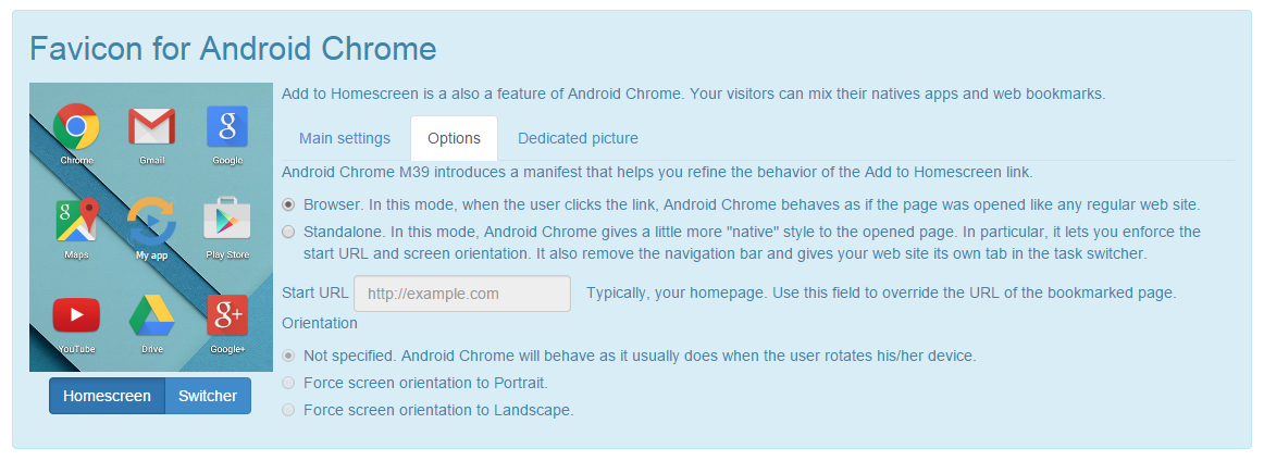
In addition, RFG supports the new manifest introduced in Android Chrome M39. With this manifest come 6 icons. Apparently Google is willing to compete with Apple and its numerous Touch icons. As an option, you can also define the other fields of the manifest: web site aspect when it is launched from the home screen link, screen orientation, etc.

Older versions of Chrome are supported: the 192x192 PNG icon is still generated and declared in the vanilla HTML.
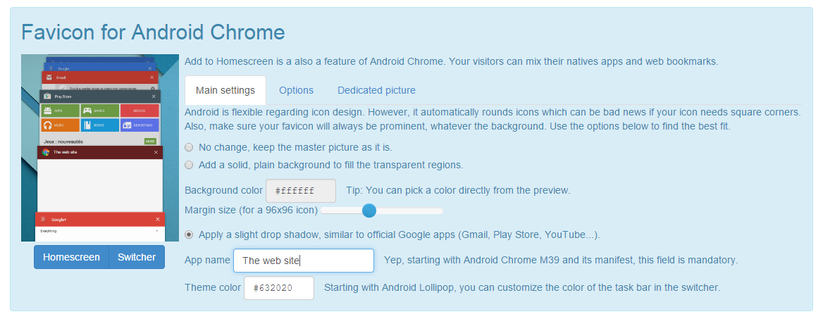
Also new with Android 5.0 Lollipop is the theme color. When listing the running apps, Android lets you define the color that fits your site best.

In the end, Google did a great move with the new manifest. It finally allows us to define a platform-specific picture for Android Chrome, which is good news. Android is different of desktop and iOS. Wanting a particular design for the home screen icon make perfect sense. That point has haunted me for some time and I'm glad I'm on my way for resilience :)
The Android Chrome icon editor is the blue print for the next improvements in the UI. In particular, icon design settings can be used along with a dedicated picture. This is a long due TODO for iOS and Windows.
I hope you will like this new addition. Let me know what could be improved!